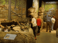
During a recent visit to Crystal Bridges Museum of American Art in Bentonville, AR, I was struck by the diversity of elements visitors could engage with throughout the space. I spoke to Kim Lý, the Museum’s interactive media producer on the creation, implementation, and maintenance of these interactive elements, which the team calls “engagements.”
Kim walks us through a variety of the Museum’s engagements and shares valuable insights about what she’s learned along the way, including expectations during the planning process vs. the realities of visitor participation.
What can you tell us about the engagements at Crystal Bridges right off the bat?
All the engagement ideas that have come out this year for in the museum are actually ideas that have been executed by our Engagement Task Force, which is an internal task force composed of members from multiple departments coming together to ideate. From there, we go through a design process that I use from the Luma Institute to narrow down our ideas.
Tell us more about this Engagement Task Force.
It’s actually been in place about a year now, and it’s evolved quite a bit. It started out as a quarterly check-in about engagements in general, what art was going to be moved and such. And in January of this year, we got news about the expansion, and that we’re going to try some experimentation when we start to reinstall artwork next year. [Ed. note: In 2026, Crystal Bridges will complete a nearly 100,000 square foot expansion.]
So, we started this year off looking at the task force as a space for collaborative ideation rather than “the curators have said this, and now we’ll just put a screen up and show this.” Now, it’s more like, what kind of experience do we want people to get out of this?
What do we want them to learn? And then going from there.
What are your top tips for creating interactive visitor engagements?
The number one thing: It’s easy in my field, specifically for people working in tech and digital at a museum, to only look to ourselves for information and ideas and execution. But I’ve found that leading the internal task force has made the process a lot easier. Gathering different perspectives from curatorial. Or getting perspective on 2D design — our graphic designers come in to ideate with us — because you’re going to learn things about user experience you wouldn’t have thought of before. I think collaborating with people from outside of your field can be really useful in terms of determining that user experience.
And number two: One of the things our team has been focusing on is looking at emotion as content. And what we mean by that is what kind of emotions do you want to evoke in your visitors when you’re providing this content and experience? That’s something we try to think through whenever we’re executing these.
What are the cost considerations you have to deal with?
Hardware can be costly — iPads are running close to two grand nowadays depending on the storage. But the biggest cost, really, is software. A lot of our software platforms are on monthly basis subscriptions.
We have done quite a wide variety of engagements involving low tech and high tech. The ones in our permanent galleries are more on the lower-tech side, but our special exhibitions such as Knowing the West and Exquisite Creatures include VR experiences developed in-house by me.
Craft Lab — Woven Community Tapestry
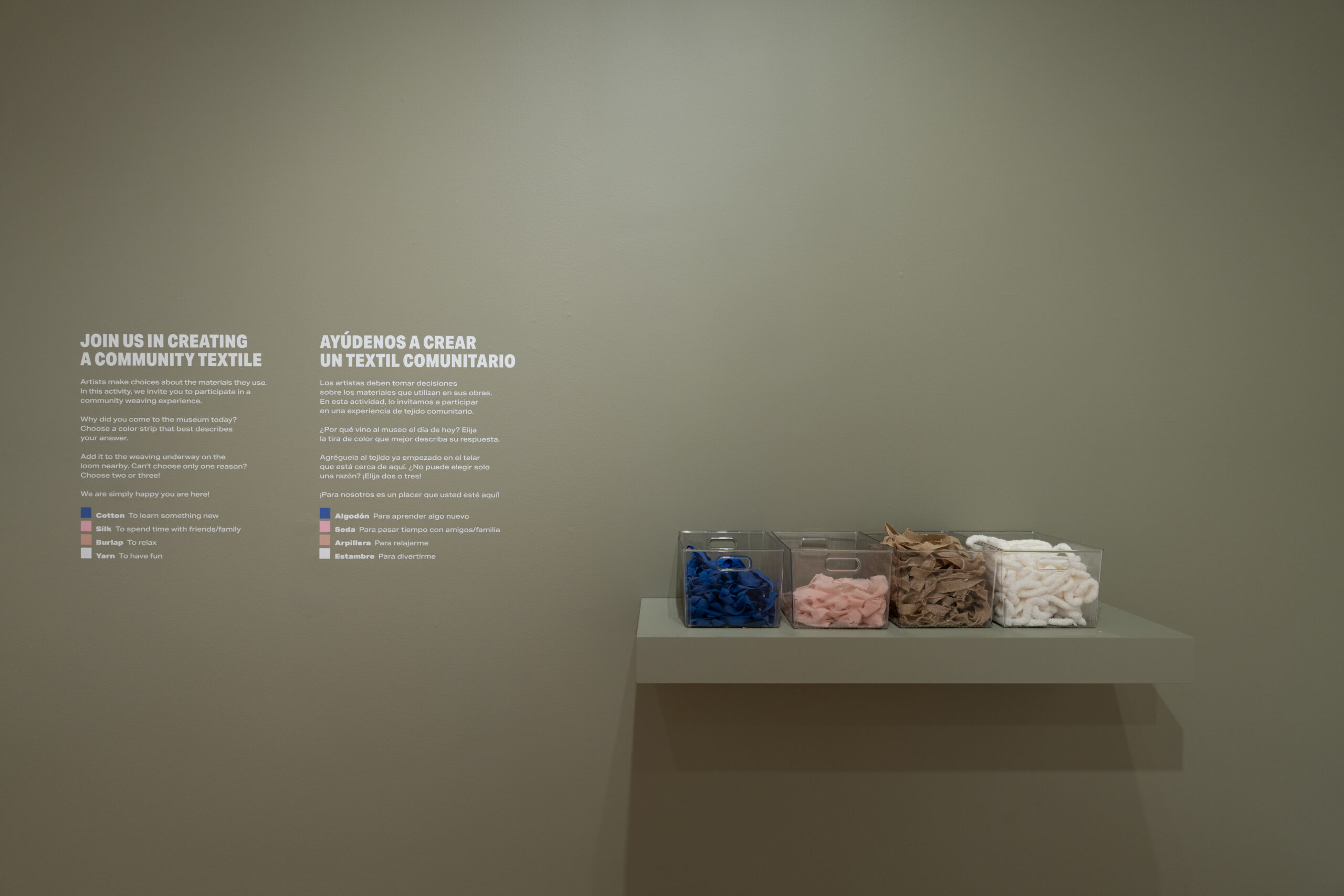
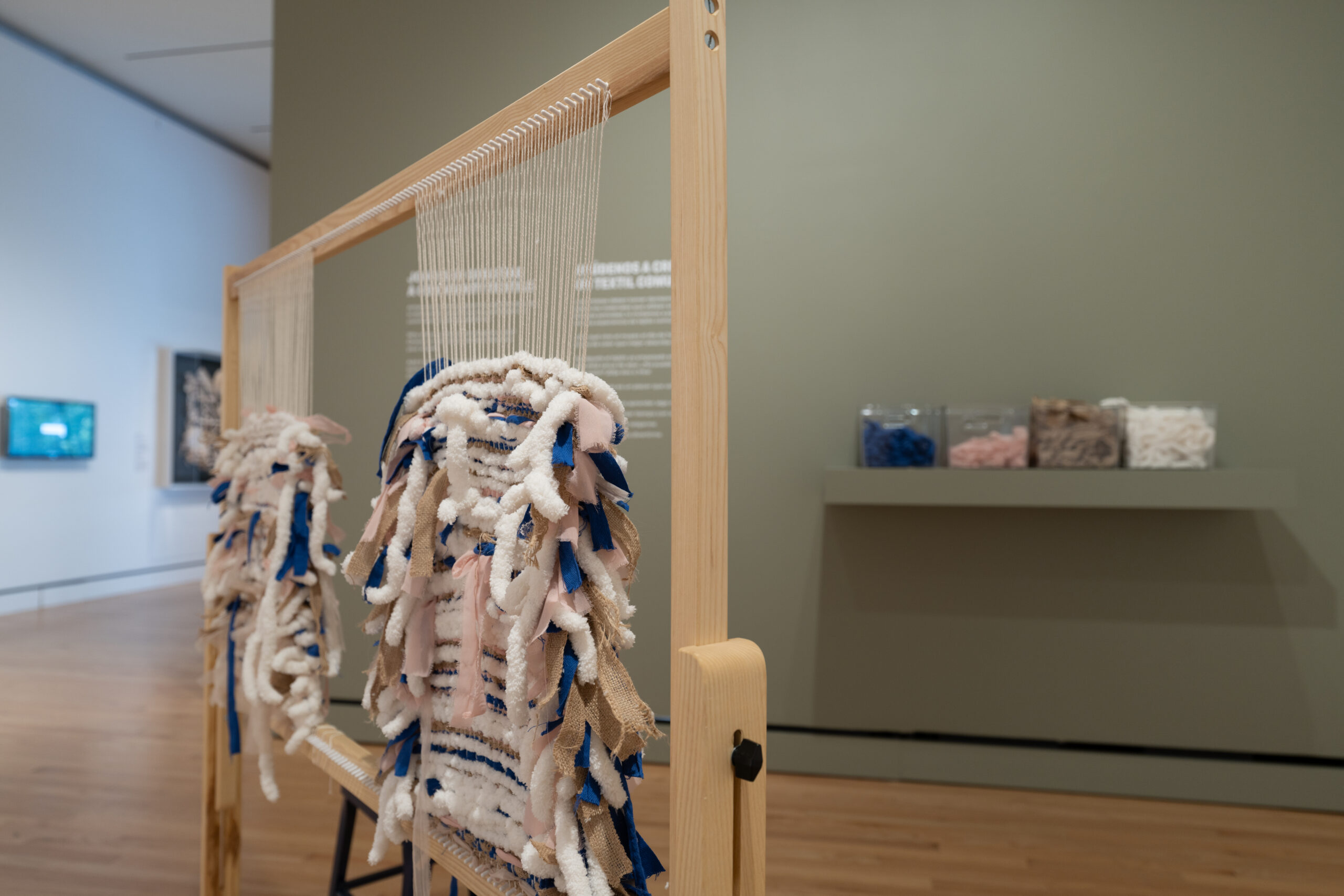
Description: Visitors approach a standing loom next to a shelf with bins of various colored and textured fabric. A call to action on the wall directs visitors to choose a strand of fabric that represents their reason for visiting Crystal Bridges and then weave it into the loom.
-
- Cotton (blue) to learn something new.
- Silk (pink) to spend time with friends/family.
- Burlap (brown) to relax.
- Yarn (white) to have fun.
My immediate question upon approach was “Are people following directions with this?”
Originally, when we planned that engagement, we thought people would choose one strand to represent their motivation for coming to the museum that day. But what we’re learning is that people are more excited about the process of weaving in general rather than picking up one strand. There’s actually quite a bit of people who come through and just start weaving multiple strands through the tapestry.
What’s your process for maintenance?
We have a great studio manager, Andy Blackwell, who manages the multigenerational space in our education wing [called Learning and Engagement]. He’s also working with me directly to come up with these tactile engagements.
Basically, he manages all the supplies, and on weekends we have volunteers come in, and he briefs them on how to refill. Saturday and Sundays are a bit busy; they’re our busiest days, and supplies get taken up really quickly.
I think we’re replenishing every day, honestly. That’s the biggest part. And what we’re seeing — we’re starting to come to this idea like, ok, maybe it’s not so much about creating a finished product. People just want to be part of the process, and sometimes we’ve been actually taking out the strands ourselves to refill the buckets and such.
Vantage Points
Description: Vantage Points is a French salon hang installed along its own corridor in the Contemporary Art Gallery. An iPad in kiosk mode is mounted at either end of the hall, offering visitors the opportunity to provide feedback by selecting an emoji to answer the question “How does the presentation of the artwork in this space make you feel?“
I was excited to discover this one. It gave me incentive to walk slowly down the hall, taking in each piece because I knew there was an activity to do at the end. Tell us about the process behind this engagement and how it’s going.
We wanted a way to incorporate a digital engagement with the physical objects. Victor Gomez, the curator of Vantage Points, thought it might be interesting to put the iPads with the artwork as part of the overall experience.
The other big part of this was that we wanted people to express themselves visually. And that’s how the emojis came about. I also left a field where you can draw in a response if you want, and it’s been really interesting to see what comes out … because people are people.
We wanted something low key that wasn’t in your face, something anybody could easily respond to. And I think it has received quite a bit more engagement than our than our other things for sure.
What do you do with the responses?
We’re not displaying the responses. I think that would require moderation by our staff. But we’re hoping to use the responses to inform us on engagements we’re looking to do for the expansion reinstallation coming up.
Talk about maintenance on this engagement.
The senior interactive tech specialists and I do a walkthrough of the galleries daily on a daily basis. We also have an art preparation team who actually installs the artwork but also does a walkthrough through the galleries. And that walkthrough is a way to see if there’s anything wrong on the screens.
But we hardly have problems as far as the maintenance phase. I think the worst issue we have is if something’s connected to Wi-Fi, such as the survey, and our Wi-Fi is acting funny. And believe it or not, most issues have a simple IT solution: Take the iPad out of the case, turn it off and on, and it’s back.
Exquisite Creatures VR Experience
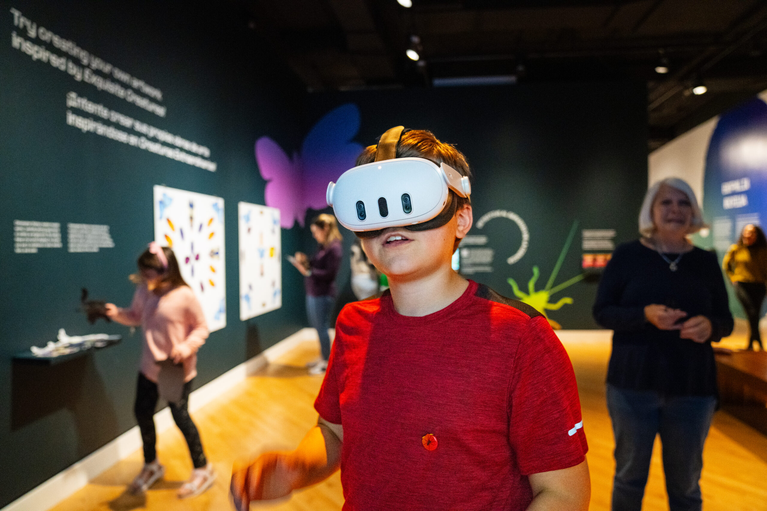
Description: Visitors are invited to put on a VR headset (Meta Quest 3) and take an immersive journey through the museum’s trails and grounds through the lenses of different creatures native to the Ozarks: fly, snake, and deer. Visitors can examine the differences of color, texture, and depth as the lens of each creature transitions automatically. [Ed. note: This experience concluded in July 2024, but you can check it out on YouTube.]
Tell us about your development process for a VR project like this.
Former Content Specialist of Art & Architecture at Crystal Bridges (and current Interpretation Specialist at the National Gallery of Art) Marie Hofer collaborated with me on the concept development and how to best connect younger audiences to the exhibition and the surrounding environment of the museum.
I filmed a 360-degree video of Crystal Bridges employees walking through the North Forest during the early golden hour on an autumn day. Then, in post-production, I edited the footage by creating image filters to represent the different creatures.
What were the biggest challenges?
The initial challenge was persuading colleagues to attend an early morning shoot. We also wanted to represent different types of visitors at the museum, so I brought my bicycle to role-play as cyclist. [Ed. note: Bentonville is known for its bike trails, and lots of visitors bike to the museum.]
The more difficult challenges occurred post-production. I created the image filters through Adobe Illustrator and Premiere Pro, taking into account the research about each animal’s vision. I also took time troubleshooting and setting up the virtual reality headset for the guest experience to be as seamless and low-touch as possible.
[Ed. note: Technical talk incoming!] Currently, there is no kiosk software available in the Meta store that allows you to automatically start-up and lock your headset into a specific application. Kiosk software is necessary whenever you would like to direct the visitor to a specific experience without interruptions such as the user accidentally exiting out of the application. To work around this issue, I disabled the VR hand controls and adjusted the command prompts within the “configuration file” of the VR headset. To view the configuration file, you need to plug in the headset to another computer. A “configuration file” on a Meta Quest 3 refers to a set of settings stored on the headset that control various aspects of its operation, including display settings, controller sensitivity, guardian boundaries, and more. Disabling the VR hand controls makes the experience more accessible to audiences who may not be familiar with using a VR headset. For this particular experience, users were only required to place the headset on their heads to operate the experience.
The final challenge for implementation was onboarding our Protection Services team and Art Preparation team on booting up and turning off the headset during the museum’s days of operation. Booting up the VR headset required turning it on and setting the guardian boundaries. Guardian boundaries are a safety feature in Meta headsets that create virtual boundaries to prevent users from bumping into objects while playing in VR. When a user approaches the edge of their play area, boundaries appear to warn them. Luckily, this specific experience was stationary and did not require users to walk around the physical or virtual room. Since the experience was a 360 video, visitors could simply turn their heads and bodies 360 degrees in one spot in order to fully be immersed.
What pearls of wisdom can you share with museums considering a VR experience?
Implementing VR experiences within museum spaces can be a great way to connect visitors to other spaces beyond the gallery wall. But onsite staffing and how you set up the VR experience is prudent for success. During the run of the exhibition, visitors were expected to read the instructions printed in vinyl on the wall in front of the headset on a pedestal. However, [we] did not have dedicated staff members to guide visitors through the VR experience. On observation we noticed patterns:
- Visitors would accidentally walk outside of the guardian boundaries long enough that the headset would show an error warning and default showing footage of the physical gallery instead of the 360 video.
- Visitors would forgo reading the text on the wall and place the headset directly on their heads. This resulted in two replacement head straps over the course of the exhibition (approximately 4 months).
Luckily, the 360 video was duplicated onto a nearby television monitor for visitors who were hesitant in using the VR headset or could not use the headset due to vision or mobility issues.
If I were to push this experience out again, I would like to work with our front-facing staff to have a dedicated team member to welcome and onboard visitors to the experience. Hosting visitors is important in meeting people where they are, whether technologically or culturally. It also protects your equipment for long-term use.
How you set up the VR experience can determine who is able to access it. Setting up the headset to be in kiosk mode is the bare necessity for public use. I’m glad I also decided to disable the hand controls so our guests wouldn’t worry about how technologically adept they were. The only thing visitors needed to do was pick up the headset, adjust the head strap by twisting the knob on the back, and place it on their heads. I saw all sorts of people use it — children and adults, including Alice Walton!
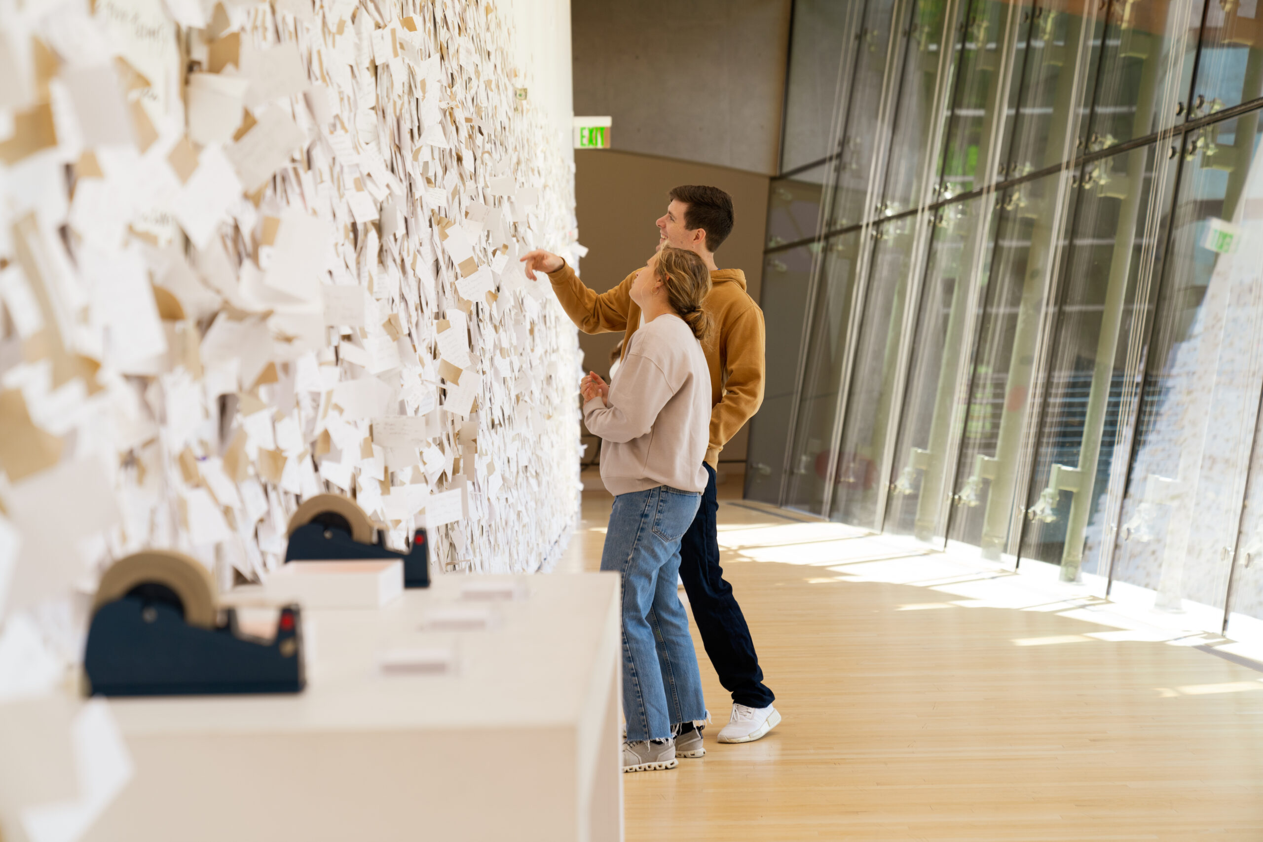
Final editor’s note: Crystal Bridges currently hosts Yoko Ono’s traveling participatory installation My Mommy Is Beautiful, which features a substantial wall on which visitors are invited to affix messages to their mothers. Because this isn’t an in-house creation, we didn’t touch on it too much in the Q&A, but it’s worth mentioning here as another low-tech-but-high-impact interactive experience at Crystal Bridges. It also very much fits the brief of “emotion as content,” which Kim mentions as a focus of their visitor engagements.
Disclosure: This interview has been edited for length and clarity.
Find Crystal Bridges Museum of American Art:
Facebook
Instagram
YouTube
LinkedIn

